Oil Painting Blog

Blog about oil paintings by Robert Dawson

Beggarbot, complete

For now, at least.

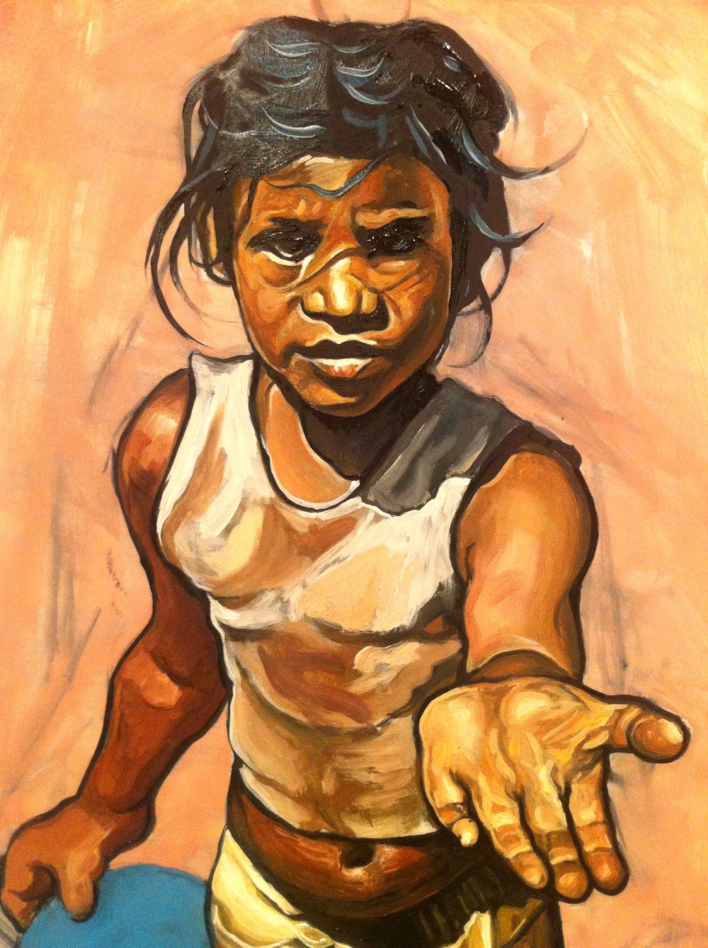
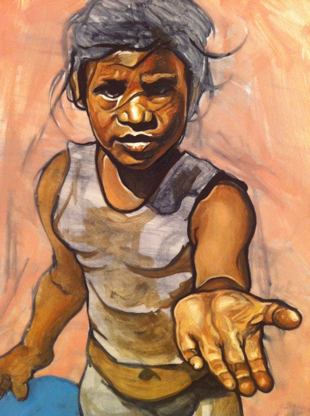
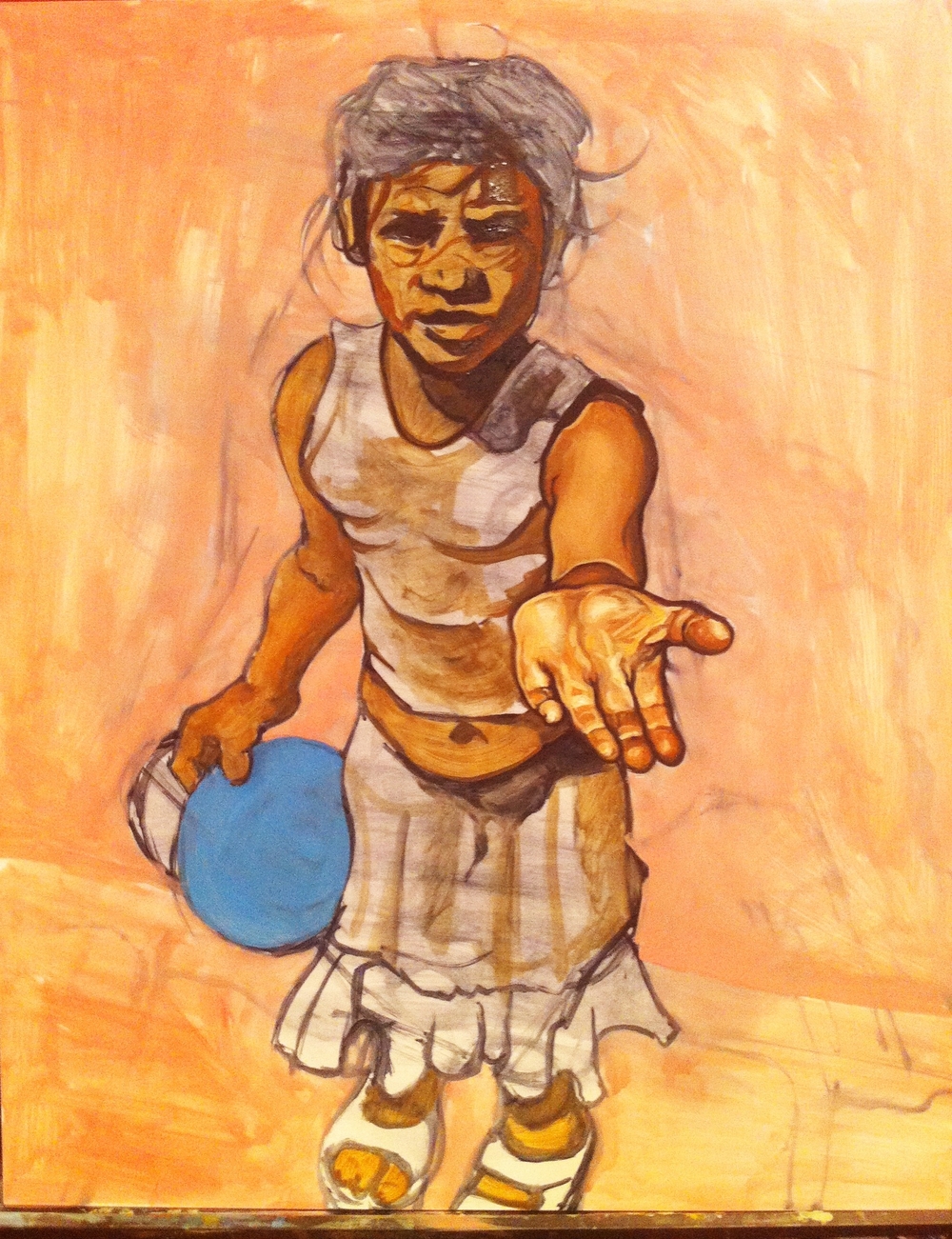
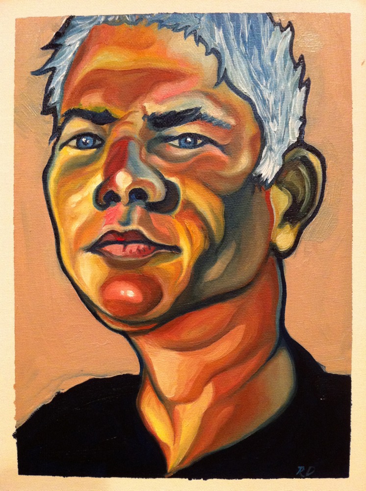
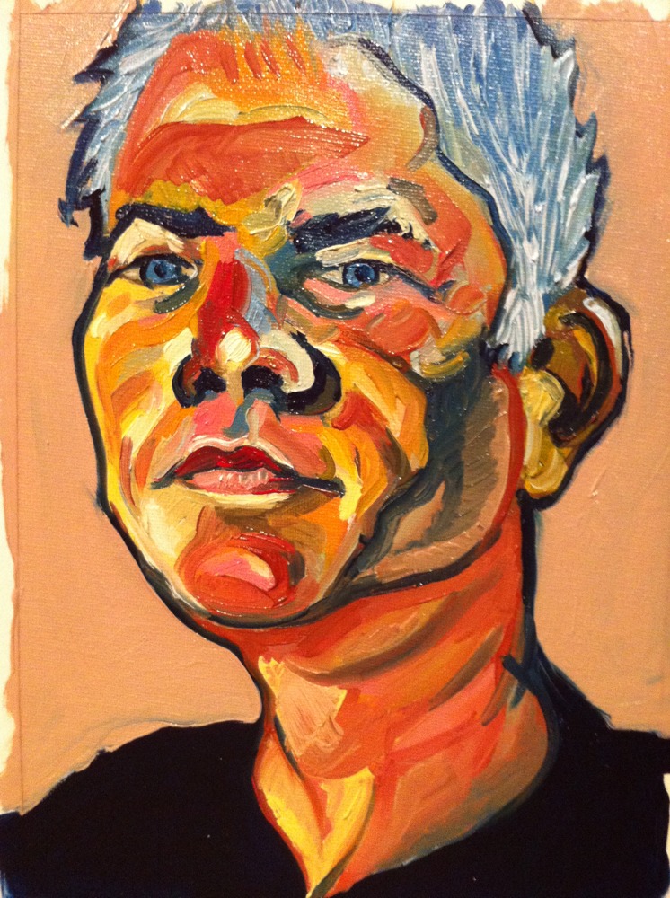
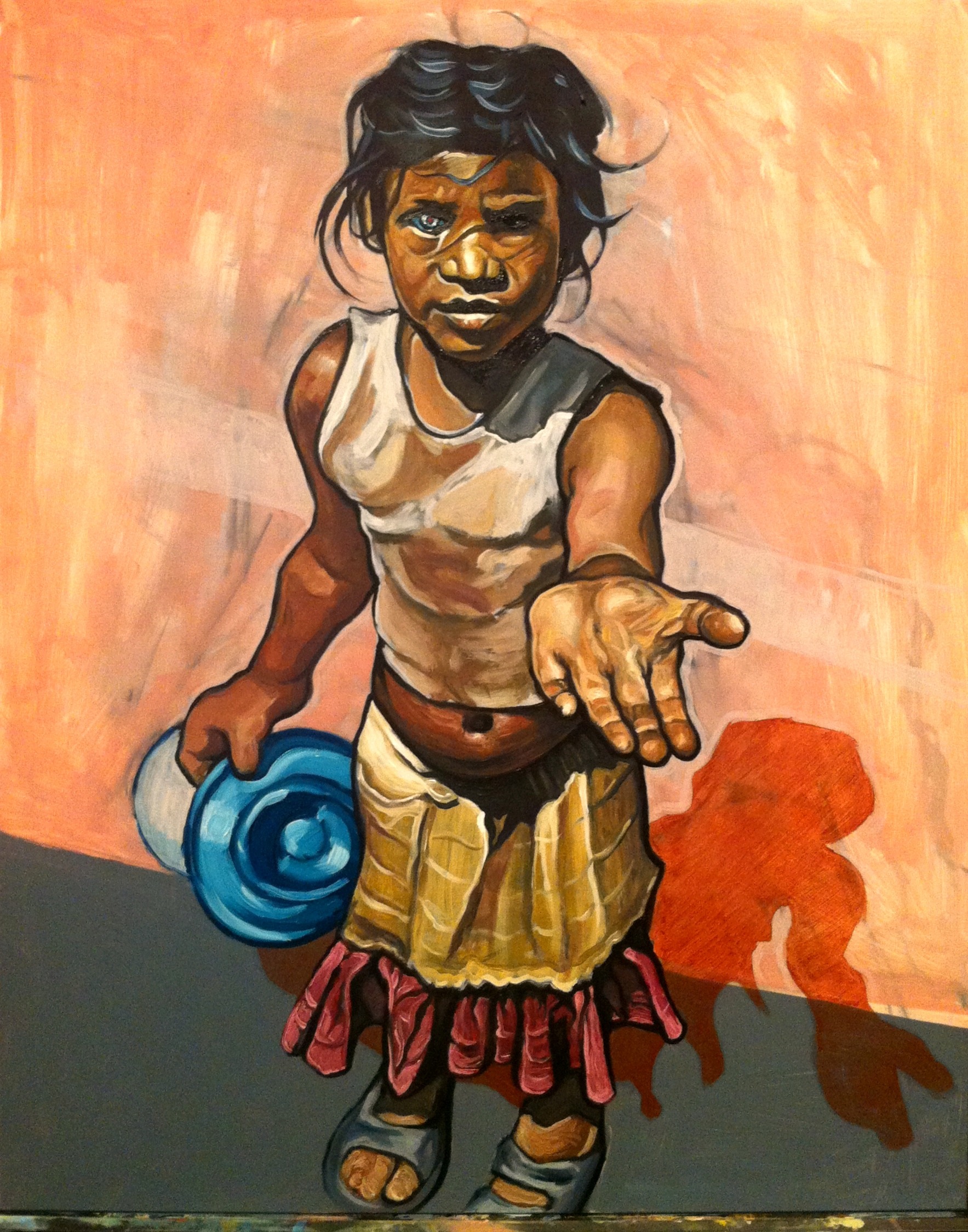
The simplest solution for turning her into a cyborg or robot was to make one eye shine, as if beaming with light from within. I thought of this today, after I had already cleaned my brushes, when I remembered that Picasso had done the same thing to symbolize the gift of prophesy. I like that the indication is subtle. And I decided to leave the bowl in her hand as a bowl and not some electronic device or something else that a robot might hold because, in the future, robots might consume human food. So this makes the question of feeding a starving robot all the more interesting and provocative.

Jordan

I began by trying to paint a photo of Michael Jordan realistically. And I made it 75% of the way. But then I got bored and began deviating from the original without rationalizing the changes. For instance, why stars? I have a good interpretation! He's thinking about fame and it's fueling his jump. But I didn't paint the stars with that in mind. The same is true of the white man's "mask," which looks to me like something a wrestler would wear. Is professional basketball set up to sell tickets and ads? Maybe. I'll let the viewer decide.

Portrait of John Cowan

This is a portrait of a friend and former co-worker, John Cowan. Aside from his day job as a lawyer, John is also a very creative artist whose work ranges from metal sculpture to comic art. I asked John to send photos of himself and this was painted from a close-up of one. I like both photos, but the light on John's face in the one from which this painting derives seems almost angelic (if I may) in that much of it is bathed in bright light and the shadows are not equally as dark but, rather, add subtle volume to his features. Of course, I couldn't help but take liberties with that, not because John is evil but because I was honestly more inspired to play with color. And I also wanted to present him in a somewhat comic-like manner.

The technique, as you can see from the progression of photos here, was to sketch him with olive green paint, block in lots of different colors, blend them, and then add detail.

  1. Sketch
  2. Block
  3. Blend
  4. Detail

I like this approach a lot. It allowed the joy of creatively applying color and the altogether different enjoyment of applying detail (although, knowing when to stop is hard). I'm not sure I will do it again exactly like this, because my current goal is to experiment and learn new techniques. My first goal was blending and now, and maybe forever, it's experimentation. It's fun! And I hope John likes it.

Process

Blending Study 1

Grade: D-

This is the first in a series of studies, the goal of which is to regain comfort with blending. I essentially gave up with this one and began adding distinguishable strokes to enhance the overall aesthetic appeal.

I tried a fan brush and found that, with this small of an image (12"x16" total), this brush doesn't work well and I am left with using either the latest brush I've loaded with paint or another brush that I set aside solely for blending.

Realism with oils

As you can see, my first oil painting, painted in 11th or 12th grade, was fairly realistic. It's not photorealistic, but it could have been with a little more time and patience. It's not bad.

Yet, I'm finding now, as I return to oils after a 15-year delay, that they, or at least the oils I have, are difficult to blend believably. The problem may be with the medium I'm using, Liquin, or perhaps with the paints themselves.

The problem I'm finding is translucency. The oils don't seem opaque enough and, when I try to blend them, they sometimes instead reveal underlying layers, often leaving a splotch of unwanted color. This happened a couple of times with my last painting, effectively restricting the level of detail and realism I felt comfortable pursuing.

I'll keep at it. My next painting will be a study of various objects. I need to know that I can paint realistically with these expensive paints, and feel comfortable doing so. I know I've just started, but I feel like this should be easier.

Homage to Coffee

The composition is a bit unsettling but the overall painting is decent for an afternoon.


Step 1: Outline and block in composition

Step 2: Add darkest darks and detail to test effect 

Step 3: Continue detail of all objects

Step 4: Add background

This procedure may not be viewed as mature, as working in a general to specific manner is quicker and much less stressful with regard to proportions. However, experimenting with the process is fun and I like how this turned out.