Grade: C
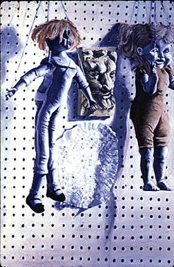
You can't see it, because it didn't turn out well (hence, why I stopped), but he's holding a gun. The idea is that power, not faith, decides the winner.
Blog about oil paintings by Robert Dawson
Grade: B-
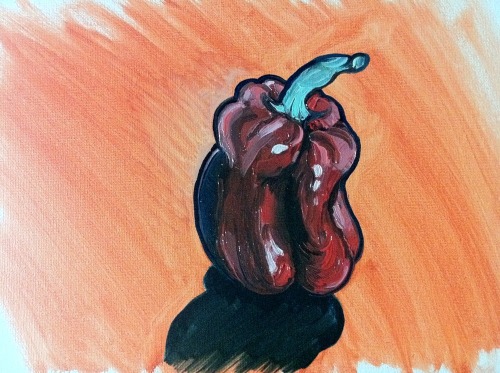
For this one, I used only Turpenoid as my medium. It works better.
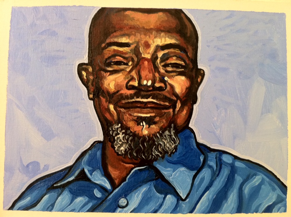
Grade: D-
This is the first in a series of studies, the goal of which is to regain comfort with blending. I essentially gave up with this one and began adding distinguishable strokes to enhance the overall aesthetic appeal.
I tried a fan brush and found that, with this small of an image (12"x16" total), this brush doesn't work well and I am left with using either the latest brush I've loaded with paint or another brush that I set aside solely for blending.
Yet, I'm finding now, as I return to oils after a 15-year delay, that they, or at least the oils I have, are difficult to blend believably. The problem may be with the medium I'm using, Liquin, or perhaps with the paints themselves.
The problem I'm finding is translucency. The oils don't seem opaque enough and, when I try to blend them, they sometimes instead reveal underlying layers, often leaving a splotch of unwanted color. This happened a couple of times with my last painting, effectively restricting the level of detail and realism I felt comfortable pursuing.
I'll keep at it. My next painting will be a study of various objects. I need to know that I can paint realistically with these expensive paints, and feel comfortable doing so. I know I've just started, but I feel like this should be easier.
In thinking about what to paint, I find myself remembering art movements and artists I discovered in art school. When browsing art in bookstores and libraries, I tend to initially gravitate towards more realistic art. And one of the art movements I loved in art school is photorealism.
Since graduating, it seems that a new variety of that movement has sprung to life called hyperrealism, which essentially takes photorealism to a new level by making a work of art look more realistic than a photograph. This is achieved by adding richer shadows, brighter highlights, and more saturated colors. In the Wikipedia article on hyperrealism above, I found several artists whose work I particularly admire:
You might ask what these artists have in common or, conversely, what others in the list of hyperrealistic artists lack. The answer is that the artists whose work I admire the most tend to interpret hyperrealism more creatively or loosely. They don't seem as bound to the creed of their movement as others in the list.
What I like about photorealism and hyperrealism is that they showcase technical proficiency. You cannot deny that the artist can paint, draw, or sculpt what he or she sees. (That is, unless they employ technical assistance, like a projector or tracing paper, tricks that may be common and can certainly be justified with a simple, if "immoral," plea to the inherent goodness of technological progress.) You look at their work and instinctively think, "This artist has talent."
However, what I dislike, and more so in the case of photorealism, is that their work typically looks exactly like a photograph. But, so what? The question isn't, "Can you make a painting look like a photograph?" but, rather, "Why should you?" I applaud technical ability, that seemingly basic ability to draw what you see, but such fidelity, while a fundamental of visual art, does not define or encapulate it. Art is more than drawing. Art is also about creativity and ideas.
So, while I deeply admire photorealism and hyperrealism, I find that they lack creativity and, aside from the call to appreciate beauty in the everyday, fail to communicate compelling ideas.
Yet, we can all certainly agree that photorealistic and hyperrealistic art can be visually stunning. With that in mind, here is another gallery of hyperrealistic artists, many of which do offer visually stunning works of art.
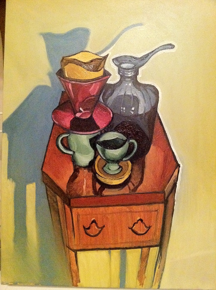
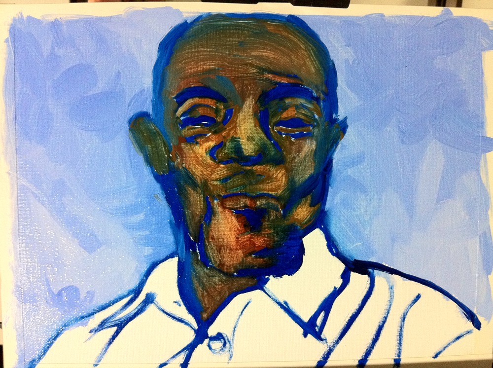
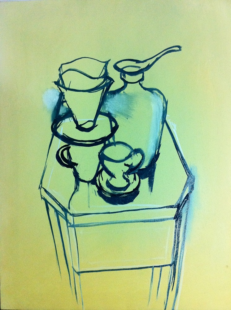
Step 1: Outline and block in composition
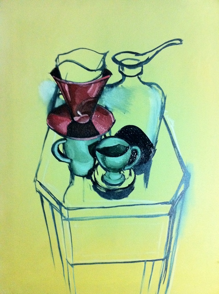
Step 2: Add darkest darks and detail to test effect
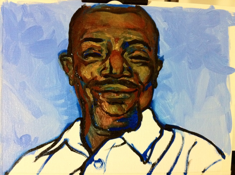
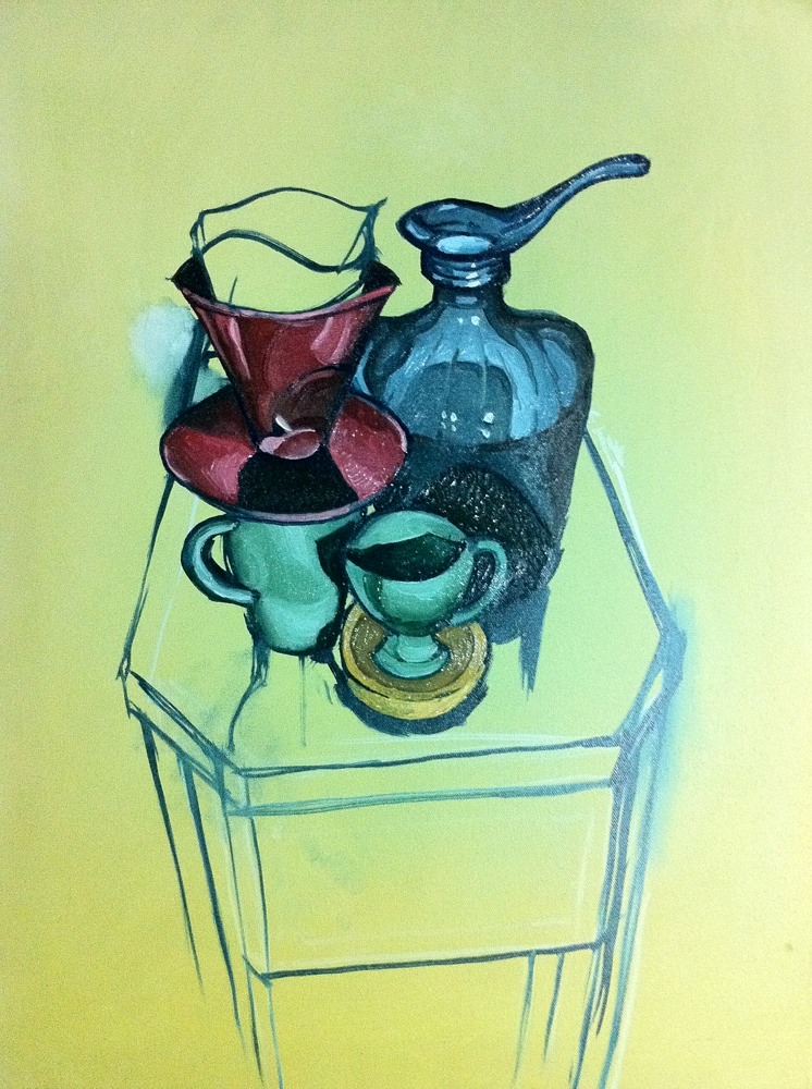
Step 3: Continue detail of all objects
Step 4: Add background
This procedure may not be viewed as mature, as working in a general to specific manner is quicker and much less stressful with regard to proportions. However, experimenting with the process is fun and I like how this turned out.
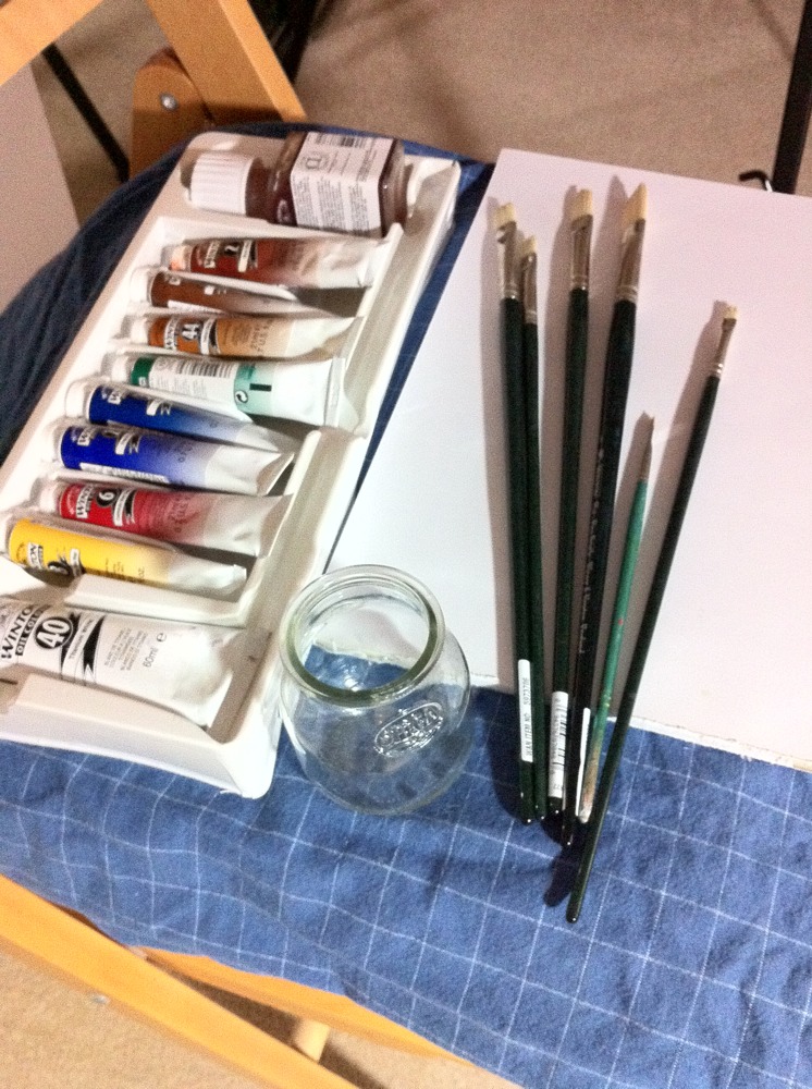
Got my materials. Now I just need to, you know, paint something.