Oil Painting Blog

Blog about oil paintings by Robert Dawson

Beggarbot, complete

For now, at least.

The simplest solution for turning her into a cyborg or robot was to make one eye shine, as if beaming with light from within. I thought of this today, after I had already cleaned my brushes, when I remembered that Picasso had done the same thing to symbolize the gift of prophesy. I like that the indication is subtle. And I decided to leave the bowl in her hand as a bowl and not some electronic device or something else that a robot might hold because, in the future, robots might consume human food. So this makes the question of feeding a starving robot all the more interesting and provocative.

Lucian Freud's color

One of my favorite figurative artists is Lucian Freud. He achieves striking volume with his use of color. Today, while watching a documentary about him, called Lucian Freud: Portraits, I noted several interesting things about his use of color that contribute to that effect.

First, he uses lots of yellow ocher and other yellows for the base of skin tones. He also uses a thick white for highlights (the exact color is mentioned in an article I found online, but I forget where). I noticed pale and light pinks for areas that project into the foreground, such as the outside edge of a thigh, dull and muted greens for recessed and shadowy areas, and, finally, maroon and other deep reds for areas of focus, like the nose.

Imcreativity - in search of impractical creativity

Tonight, I turned my attention to the meaning of creativity. Wikipedia defines creativity as that which is both novel and useful. Using this definition, any new product or technology is creative.

But is art useful? My first thought is no. However, the reinforcement of beauty is a very useful pursuit in that it is often forgotten amid the plethora of pain and suffering we encounter. But is appreciation on par with practical use, as in the case of a new product or technology? If you're trying to save a life, then appreciation is not only useless but irrational. However, if you're trying to cheer someone up, then don't count on a shiny new toy to bring a lasting smile. Although, a novel antidepressant might help.

I'll leave it up to others to compare the importance of appreciation and action in our lives. What I want to do is to plant the seed of a new kind of creativity that is more suited to art. This kind of creativity is novel, but it is not useful. It is impractical. To distinguish this from creativity, I call this imcreativity. If something is imcreative, then it is new and worthy of appreciation but not useful and cannot be applied to achieve a practical result.

An example of an imcreative work of art is Dalí's The Persistence of Memory. This famous painting brings to mind any number of strange thoughts, like the relativity of time, a summer day so hot that even clocks melt, a paranoid man who was deathly afraid of grasshoppers, and so on. But is this painting useful in any real sense, except perhaps for understanding more about Dalí or his ingenious and outrageous self-promotion techniques? I don't see how.

Of course everything can be useful for something, even if only to recognize that it isn't useful and that a useful use of time would be not to waste any more time thinking about it. But that useless scenario aside, some things are clearly not useful while also being worthy of appreciation. Art tends to fall into this category in that, like philosophy, it does not seek to provide useful answers but to provoke interesting questions. A beautiful seascape painting is certainly worthy of appreciation, but it will not buy you a yacht. It will, however, help you appreciate the beauty of nature, just as an abstract painting might, if you open your mind wide enough, help you appreciate color and form in nature.

Back to my notion of imcreativity, I find it, as a concept, useful because it frees me to explore dissimilar concepts in a visual space without worrying that it makes a point (i.e., that it serves as an illustration). Art blurs boundaries and being imcreative helps it achieve that.

Relevant art today

It seems to me that art today should either be pretty or make a point, with the former being the wiser of choices. Art no longer has to make an aristocrat look stately or serve the Church. Today, it's free to do whatever it wants, including announce that it's not art at all or, conversely, that everything is.

But to make art relevant or meaningful to modern audiences, it needs to mean something to them. And in this age, people, at least those with Internet access, seem to be thinking about such issues as information overload, trivial virtual social connections, the increasing loss of privacy online, and rampant identify theft.

Then again, art can address any social issue and remain relevant. And it should. It's visual communication. It should say everything that's interesting visually, which is just about everything.

And I say that making pretty art is wiser because, at the end of the day, after either our battles have been won or we are tired of fighting them, what matters most are that we still want to fight, to live, and to appreciate the value of living. And beauty adds value.

Jordan

I began by trying to paint a photo of Michael Jordan realistically. And I made it 75% of the way. But then I got bored and began deviating from the original without rationalizing the changes. For instance, why stars? I have a good interpretation! He's thinking about fame and it's fueling his jump. But I didn't paint the stars with that in mind. The same is true of the white man's "mask," which looks to me like something a wrestler would wear. Is professional basketball set up to sell tickets and ads? Maybe. I'll let the viewer decide.

What I'm learning

I am learning two things about my art, specifically oil painting, that I need to find what I love to make (as art) and that I need to embrace some measure of irrationality. With regard to subject, it hit me that I have little interest, aside the fun of playing or the technical challenge, in painting, for example, a still life with random objects. This might sound like a strange thought, but thinking about it made me realize that I haven't taken much time to think about what I want to paint, and specifically to paint to remember. I need to care about an object before I paint it. The same applies to the people I paint, in which case, I have to at least find them psychologically interesting.

Second, with regard to irrationality, it hit me yesterday that one reason my paintings aren't very interesting so far is that they don't allow for enough disorder, such as unfinished strokes or strikingly raw colors and lines. And to create such disorder, I need to be in a mindset that encourages it, which isn't pure practicality. I think the most interesting paintings balance order with disorder or, at least, give disorder a rightful spot at the table.

And on an unrelated aside, I've gleefully rediscovered the work of Frans Hals.

In honor of Eric the Thief

Today, I plan to paint Michael Jordan. Why Jordan? Because it takes me back to my first days with art. And in memory of a great young technician.

I attended a magnet school in junior high. This is where I took my first art class. One of the kids in that class could draw exceedingly well. I think his name was Eric. Eric really inspired me, showing me what someone could do technically with art at such a young age.

Unfortunately, one day, Eric stole something, I believe it was a handful of colored pencils, and found himself expelled. He might have stolen more than once, I forget. But seeing him go was tragic. Had I been my art teacher, I would have tried my best to keep him at school and I would have bought him a set of colored pencils or whatever else he needed to continue making art. Maybe my teacher did try, but I never heard about it if so.

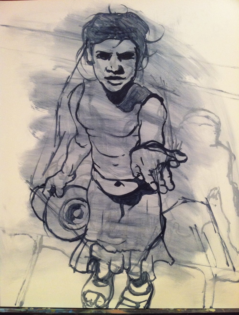
Eric liked to draw basketball players. Specifically, I think he liked to draw Michael Jordan, which would be understandable given the man's talent. So, in memory of Eric the Thief, I plan to paint an action shot of Jordan. Only, I'll use oils, because that's what I'm into. Sorry, Eric, but I'd also have to steal a set of colored pencils if I didn't want to throw down a pile of money, because, you're right. Colored pencils are overpriced.

But that's not all I plan to paint. Eric also liked to draw, or did draw at least once, a crumpled Coca Cola can. Yes, in colored pencil. It was amazing, almost like a photo. So, that's what I'll paint after Jordan.

The other reason I plan to paint a Coke can is that it seems to be a rite of passage for artists in the US, at least those of my generation. If you can draw a crumpled Coke can realistically, then you can draw. I've never tried.

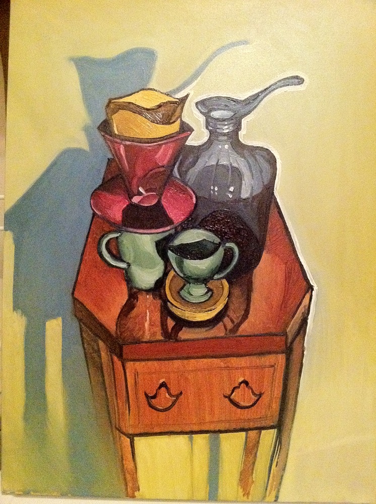
I should add that these paintings are what I'm calling "break" paintings. They’re paintings that I plan to create between paintings for other people. In this case, this is a series, short at present with only two paintings included, of art related to my first days with art. So, actually, I will probably also paint ninjas and the Hulk at some point. Ooh, maybe ninjas vs. the Hulk!

Blending success!

It's a small feat, but I'm happy to note that I have, let's say since it's not perfect, sketched out a solution to the problem of blending with oils.


As I say, it's not perfect. You can see brushstrokes and this picture, because it's a close-up, is grainy. But it is a leap forward compared to previous work.

And, yes, this is a new painting. It's a surprise for someone. It's also unfinished. So, I can't show it yet. Soon!

Portrait of John Cowan

This is a portrait of a friend and former co-worker, John Cowan. Aside from his day job as a lawyer, John is also a very creative artist whose work ranges from metal sculpture to comic art. I asked John to send photos of himself and this was painted from a close-up of one. I like both photos, but the light on John's face in the one from which this painting derives seems almost angelic (if I may) in that much of it is bathed in bright light and the shadows are not equally as dark but, rather, add subtle volume to his features. Of course, I couldn't help but take liberties with that, not because John is evil but because I was honestly more inspired to play with color. And I also wanted to present him in a somewhat comic-like manner.

The technique, as you can see from the progression of photos here, was to sketch him with olive green paint, block in lots of different colors, blend them, and then add detail.

  1. Sketch
  2. Block
  3. Blend
  4. Detail

I like this approach a lot. It allowed the joy of creatively applying color and the altogether different enjoyment of applying detail (although, knowing when to stop is hard). I'm not sure I will do it again exactly like this, because my current goal is to experiment and learn new techniques. My first goal was blending and now, and maybe forever, it's experimentation. It's fun! And I hope John likes it.

Process

Against efficiency as a motivating factor in the production of art

I’m painting in oils again. A traditional medium. Slow. Messy. Smelly. I love it!

I'm getting comfortable with it, relearning how to blend and, generally speaking, to use the medium, tools, and ground, themselves, to reveal a pleasing result.

But it takes work. And one of my current, preparatory goals is realism. Accuracy. Not photorealism, because I like brushstrokes (and why not take a photo?). But to make what I paint look like what I see. I'm pretty good at it without assistance.

But what if I do use assistance? What if, for example, I paint on top of a photograph or a tracing from one? There don't have to be any rules in art, so I wouldn't be cheating. I'm my own authority (aside from nature). And the process would be faster. I'm already using a grid to ensure basic proportionality in a portrait I'm painting now. So, why not go the limit and automate and, it would seem, improve the process as much as possible?

But it feels wrong! It's boring. Boring is wrong. I might as well work in a paint-by-number factory.

It isn't art. Okay, it could be a Warholian commentary on consumerism (even though we're into prosumerism). Art can be anything. But punish myself in the repetitive, robotic (no offense, future overlords) process? Shoot me.

Blending Study 1

Grade: D-

This is the first in a series of studies, the goal of which is to regain comfort with blending. I essentially gave up with this one and began adding distinguishable strokes to enhance the overall aesthetic appeal.

I tried a fan brush and found that, with this small of an image (12"x16" total), this brush doesn't work well and I am left with using either the latest brush I've loaded with paint or another brush that I set aside solely for blending.

Realism with oils

As you can see, my first oil painting, painted in 11th or 12th grade, was fairly realistic. It's not photorealistic, but it could have been with a little more time and patience. It's not bad.

Yet, I'm finding now, as I return to oils after a 15-year delay, that they, or at least the oils I have, are difficult to blend believably. The problem may be with the medium I'm using, Liquin, or perhaps with the paints themselves.

The problem I'm finding is translucency. The oils don't seem opaque enough and, when I try to blend them, they sometimes instead reveal underlying layers, often leaving a splotch of unwanted color. This happened a couple of times with my last painting, effectively restricting the level of detail and realism I felt comfortable pursuing.

I'll keep at it. My next painting will be a study of various objects. I need to know that I can paint realistically with these expensive paints, and feel comfortable doing so. I know I've just started, but I feel like this should be easier.

Inspiration - Photorealism and Hyperrealism


In thinking about what to paint, I find myself remembering art movements and artists I discovered in art school. When browsing art in bookstores and libraries, I tend to initially gravitate towards more realistic art. And one of the art movements I loved in art school is photorealism.

Since graduating, it seems that a new variety of that movement has sprung to life called hyperrealism, which essentially takes photorealism to a new level by making a work of art look more realistic than a photograph. This is achieved by adding richer shadows, brighter highlights, and more saturated colors. In the Wikipedia article on hyperrealism above, I found several artists whose work I particularly admire:

You might ask what these artists have in common or, conversely, what others in the list of hyperrealistic artists lack. The answer is that the artists whose work I admire the most tend to interpret hyperrealism more creatively or loosely. They don't seem as bound to the creed of their movement as others in the list.

What I like about photorealism and hyperrealism is that they showcase technical proficiency. You cannot deny that the artist can paint, draw, or sculpt what he or she sees. (That is, unless they employ technical assistance, like a projector or tracing paper, tricks that may be common and can certainly be justified with a simple, if "immoral," plea to the inherent goodness of technological progress.) You look at their work and instinctively think, "This artist has talent."

However, what I dislike, and more so in the case of photorealism, is that their work typically looks exactly like a photograph. But, so what? The question isn't, "Can you make a painting look like a photograph?" but, rather, "Why should you?" I applaud technical ability, that seemingly basic ability to draw what you see, but such fidelity, while a fundamental of visual art, does not define or encapulate it. Art is more than drawing. Art is also about creativity and ideas.

So, while I deeply admire photorealism and hyperrealism, I find that they lack creativity and, aside from the call to appreciate beauty in the everyday, fail to communicate compelling ideas.

Yet, we can all certainly agree that photorealistic and hyperrealistic art can be visually stunning. With that in mind, here is another gallery of hyperrealistic artists, many of which do offer visually stunning works of art.

Homage to Coffee

The composition is a bit unsettling but the overall painting is decent for an afternoon.


Step 1: Outline and block in composition

Step 2: Add darkest darks and detail to test effect 

Step 3: Continue detail of all objects

Step 4: Add background

This procedure may not be viewed as mature, as working in a general to specific manner is quicker and much less stressful with regard to proportions. However, experimenting with the process is fun and I like how this turned out.