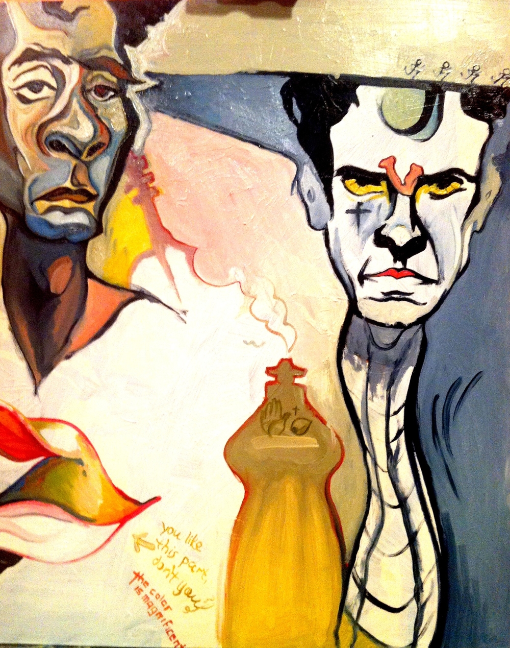
Might stop here. Probably not but probably should.
Oil Painting Blog
Blog about oil paintings by Robert Dawson
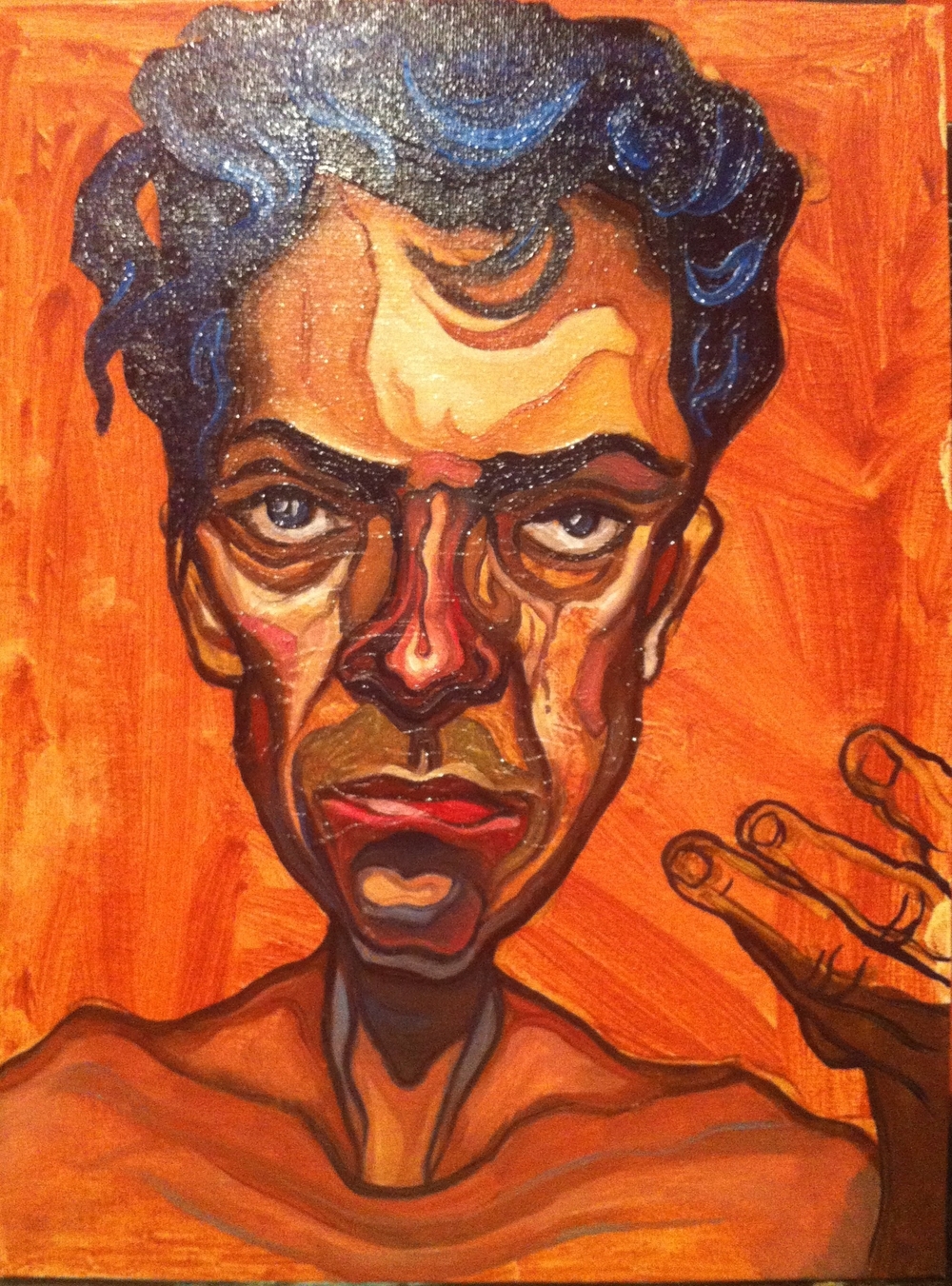
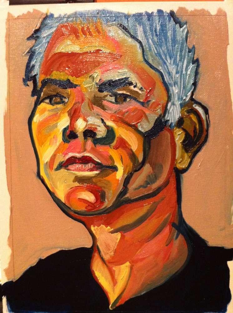
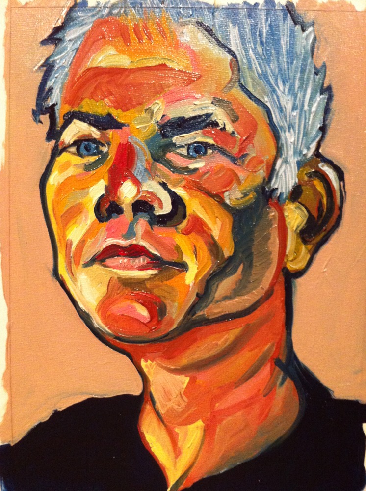
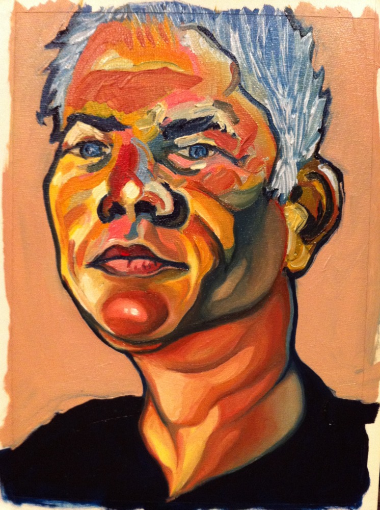
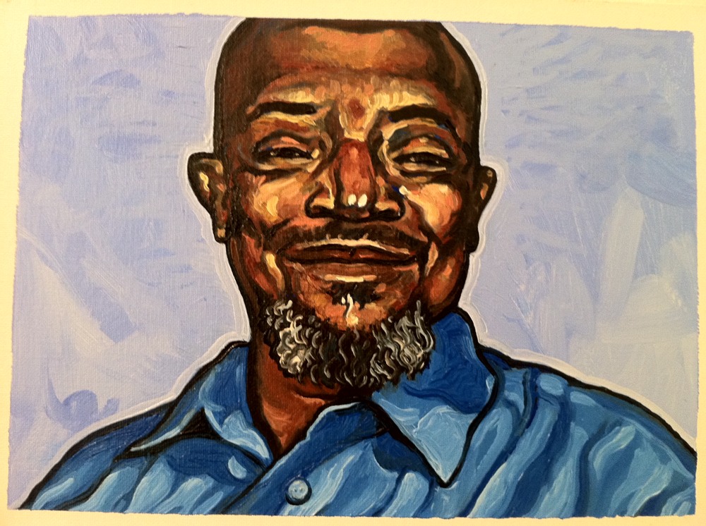
Reworking Elliott
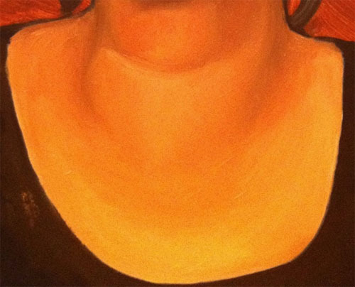
Portrait of Elliott (detail)
I'm thinking that I want to focus on shadows and exaggerate values by delineation.
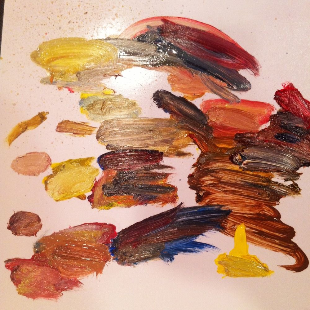
Below is the palette so far. I've limited my color choices hoping that a rich set of values will emerge.
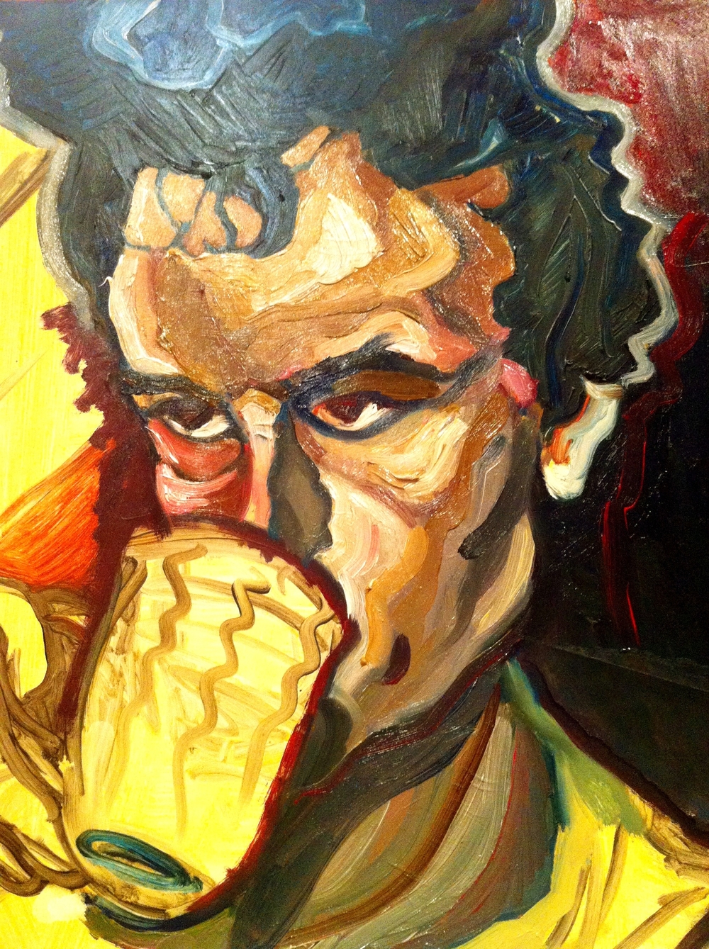
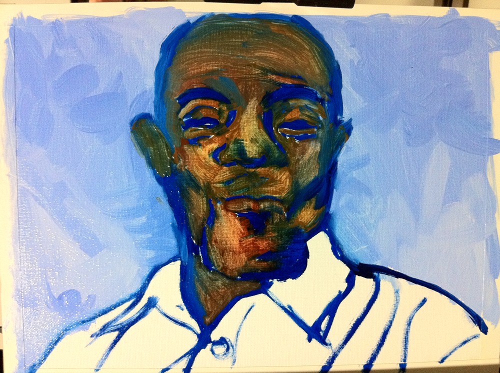
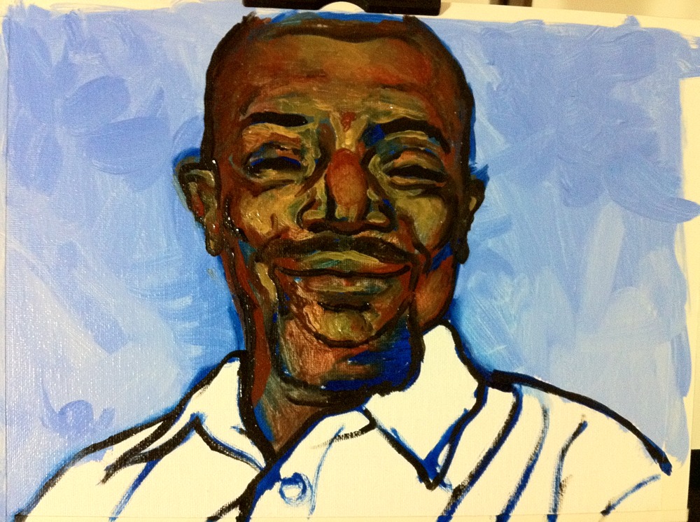
Jordan

I began by trying to paint a photo of Michael Jordan realistically. And I made it 75% of the way. But then I got bored and began deviating from the original without rationalizing the changes. For instance, why stars? I have a good interpretation! He's thinking about fame and it's fueling his jump. But I didn't paint the stars with that in mind. The same is true of the white man's "mask," which looks to me like something a wrestler would wear. Is professional basketball set up to sell tickets and ads? Maybe. I'll let the viewer decide.
What I'm learning
I am learning two things about my art, specifically oil painting, that I need to find what I love to make (as art) and that I need to embrace some measure of irrationality. With regard to subject, it hit me that I have little interest, aside the fun of playing or the technical challenge, in painting, for example, a still life with random objects. This might sound like a strange thought, but thinking about it made me realize that I haven't taken much time to think about what I want to paint, and specifically to paint to remember. I need to care about an object before I paint it. The same applies to the people I paint, in which case, I have to at least find them psychologically interesting.
Second, with regard to irrationality, it hit me yesterday that one reason my paintings aren't very interesting so far is that they don't allow for enough disorder, such as unfinished strokes or strikingly raw colors and lines. And to create such disorder, I need to be in a mindset that encourages it, which isn't pure practicality. I think the most interesting paintings balance order with disorder or, at least, give disorder a rightful spot at the table.
And on an unrelated aside, I've gleefully rediscovered the work of Frans Hals.
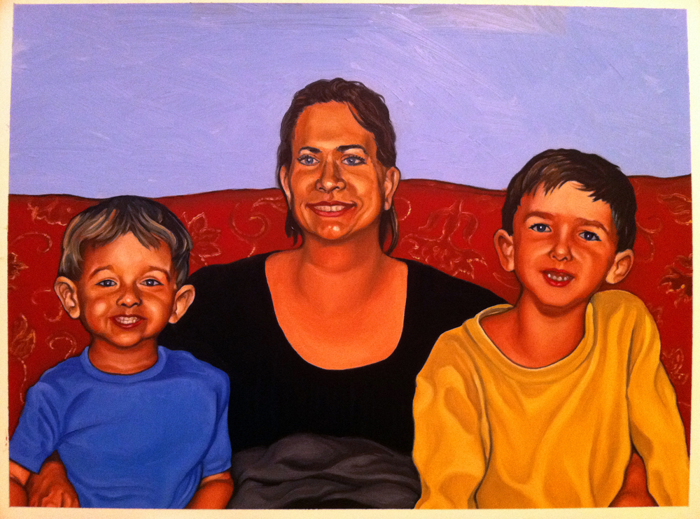
Portrait of sister and two nephews
In honor of Eric the Thief
Today, I plan to paint Michael Jordan. Why Jordan? Because it takes me back to my first days with art. And in memory of a great young technician.
I attended a magnet school in junior high. This is where I took my first art class. One of the kids in that class could draw exceedingly well. I think his name was Eric. Eric really inspired me, showing me what someone could do technically with art at such a young age.
Unfortunately, one day, Eric stole something, I believe it was a handful of colored pencils, and found himself expelled. He might have stolen more than once, I forget. But seeing him go was tragic. Had I been my art teacher, I would have tried my best to keep him at school and I would have bought him a set of colored pencils or whatever else he needed to continue making art. Maybe my teacher did try, but I never heard about it if so.
Eric liked to draw basketball players. Specifically, I think he liked to draw Michael Jordan, which would be understandable given the man's talent. So, in memory of Eric the Thief, I plan to paint an action shot of Jordan. Only, I'll use oils, because that's what I'm into. Sorry, Eric, but I'd also have to steal a set of colored pencils if I didn't want to throw down a pile of money, because, you're right. Colored pencils are overpriced.
But that's not all I plan to paint. Eric also liked to draw, or did draw at least once, a crumpled Coca Cola can. Yes, in colored pencil. It was amazing, almost like a photo. So, that's what I'll paint after Jordan.
The other reason I plan to paint a Coke can is that it seems to be a rite of passage for artists in the US, at least those of my generation. If you can draw a crumpled Coke can realistically, then you can draw. I've never tried.
I should add that these paintings are what I'm calling "break" paintings. They’re paintings that I plan to create between paintings for other people. In this case, this is a series, short at present with only two paintings included, of art related to my first days with art. So, actually, I will probably also paint ninjas and the Hulk at some point. Ooh, maybe ninjas vs. the Hulk!
Blending success!
It's a small feat, but I'm happy to note that I have, let's say since it's not perfect, sketched out a solution to the problem of blending with oils.
As I say, it's not perfect. You can see brushstrokes and this picture, because it's a close-up, is grainy. But it is a leap forward compared to previous work.
And, yes, this is a new painting. It's a surprise for someone. It's also unfinished. So, I can't show it yet. Soon!
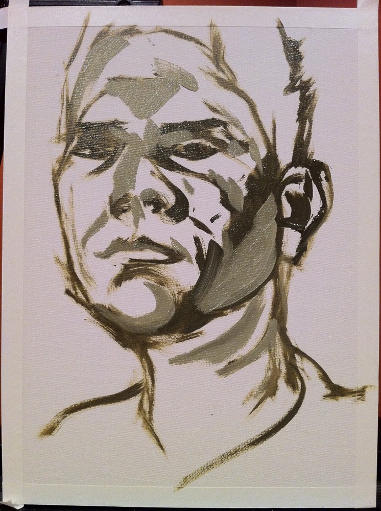
Portrait of John Cowan
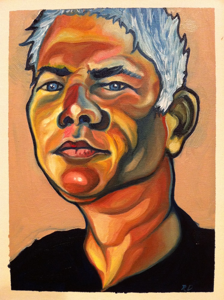
This is a portrait of a friend and former co-worker, John Cowan. Aside from his day job as a lawyer, John is also a very creative artist whose work ranges from metal sculpture to comic art. I asked John to send photos of himself and this was painted from a close-up of one. I like both photos, but the light on John's face in the one from which this painting derives seems almost angelic (if I may) in that much of it is bathed in bright light and the shadows are not equally as dark but, rather, add subtle volume to his features. Of course, I couldn't help but take liberties with that, not because John is evil but because I was honestly more inspired to play with color. And I also wanted to present him in a somewhat comic-like manner.
The technique, as you can see from the progression of photos here, was to sketch him with olive green paint, block in lots of different colors, blend them, and then add detail.
- Sketch
- Block
- Blend
- Detail
I like this approach a lot. It allowed the joy of creatively applying color and the altogether different enjoyment of applying detail (although, knowing when to stop is hard). I'm not sure I will do it again exactly like this, because my current goal is to experiment and learn new techniques. My first goal was blending and now, and maybe forever, it's experimentation. It's fun! And I hope John likes it.
Process
Realism with oils
Yet, I'm finding now, as I return to oils after a 15-year delay, that they, or at least the oils I have, are difficult to blend believably. The problem may be with the medium I'm using, Liquin, or perhaps with the paints themselves.
The problem I'm finding is translucency. The oils don't seem opaque enough and, when I try to blend them, they sometimes instead reveal underlying layers, often leaving a splotch of unwanted color. This happened a couple of times with my last painting, effectively restricting the level of detail and realism I felt comfortable pursuing.
I'll keep at it. My next painting will be a study of various objects. I need to know that I can paint realistically with these expensive paints, and feel comfortable doing so. I know I've just started, but I feel like this should be easier.
Glenn
Inspiration - Photorealism and Hyperrealism
In thinking about what to paint, I find myself remembering art movements and artists I discovered in art school. When browsing art in bookstores and libraries, I tend to initially gravitate towards more realistic art. And one of the art movements I loved in art school is photorealism.
Since graduating, it seems that a new variety of that movement has sprung to life called hyperrealism, which essentially takes photorealism to a new level by making a work of art look more realistic than a photograph. This is achieved by adding richer shadows, brighter highlights, and more saturated colors. In the Wikipedia article on hyperrealism above, I found several artists whose work I particularly admire:
- Antonio López
- David Kassan
- Sebastian Kruger
- Andrey Lekarski
- Jerry Ott
- Glennray Tutor
- Alison Van Pelt
You might ask what these artists have in common or, conversely, what others in the list of hyperrealistic artists lack. The answer is that the artists whose work I admire the most tend to interpret hyperrealism more creatively or loosely. They don't seem as bound to the creed of their movement as others in the list.
What I like about photorealism and hyperrealism is that they showcase technical proficiency. You cannot deny that the artist can paint, draw, or sculpt what he or she sees. (That is, unless they employ technical assistance, like a projector or tracing paper, tricks that may be common and can certainly be justified with a simple, if "immoral," plea to the inherent goodness of technological progress.) You look at their work and instinctively think, "This artist has talent."
However, what I dislike, and more so in the case of photorealism, is that their work typically looks exactly like a photograph. But, so what? The question isn't, "Can you make a painting look like a photograph?" but, rather, "Why should you?" I applaud technical ability, that seemingly basic ability to draw what you see, but such fidelity, while a fundamental of visual art, does not define or encapulate it. Art is more than drawing. Art is also about creativity and ideas.
So, while I deeply admire photorealism and hyperrealism, I find that they lack creativity and, aside from the call to appreciate beauty in the everyday, fail to communicate compelling ideas.
Yet, we can all certainly agree that photorealistic and hyperrealistic art can be visually stunning. With that in mind, here is another gallery of hyperrealistic artists, many of which do offer visually stunning works of art.